



H. J. Moll-Carrillo, Gitta Salomon, Matthew Marsh, Jane Fulton Suri, Peter Spreenberg
IDEO Product Development
1527 Stockton Street San Francisco, CA 94133
415.397.1236 vox 415.397.0823 fax
hector@IDEO.com
gitta@IDEO.com
mMarsh@IDEO.com
jane@IDEO.com
spreenberg@IDEO.com
The design also needed to accommodate a wide range of users; it would be bundled
with all Compaq computers. The main target group, however, were novice and intermediate
users. Novices were defined as first-time computer users who expected some "out-of-the-box"
functionality. Intermediate users were those already familiar with computers at home or the
office but not proficient enough to significantly customize or troubleshoot their setups.
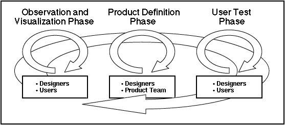
Figure 1 shows the three main phases of our iterative design process for this
project. Each one is depicted as a cycle because iterations occurred within it. In the
Observation/Visualization Phase we applied previous experience, knowledge of related materials
and insights gained from informal observation of users' tasks, environment and tools to generate
and visualize ideas. During the Product Definition Phase we worked with the XSoft team - using
these preliminary ideas - to further refine the feature set and the proposed interface. Features
and interface ideas were approved, rejected or found in need of further refinement based on
perceived value, implementation constraints and product release dates. In the User Test Phase
key product elements were evaluated with users. These three phases were part of a larger
iterative process that lead to the final product implementation.
FIGURE 1. Caption: The Idealized Process. Development of the
interface followed an
iterative process consisting of three phases.
The remainder of this briefing describes our design process and provides examples
from each of the three phases to illustrate how and why specific design decisions were made and
how we collaborated with XSoft.
Organization/access refers to making current and relevant documents easy to find
and retrieve in order to work with them. Obvious and accessible spatial groupings, such as piles,
were used most often as a strategy for containing these items. Users also needed to move
documents from one place to another or transfer ownership to others. Folders and binders were
often the mechanisms used to complete these transportation tasks. Safekeeping involved the use
of drawers and file cabinets to archive or secure items.
The character, style, functionality and interchangeability of real-world containers
varied greatly. We observed that most users kept tools and documents close at hand but in
distinct groups and containers. For example, pencils and rulers were stored separately from
documents. Three-ring binders were one notable exception; some had penholders, rulers, pockets
and floppy-disk holders built into them.
In addition, the observations helped us validate the applicability of a book metaphor
- specifically a binder metaphor - as a container to organize and access applications and
documents within a computer system. We found that collecting diverse but related documents
into ringed-binders was an experience familiar to most users. It was common among the users
we observed to have assembled these collections themselves or to have used them.
Norton Desktop for Windows replaces Program Manager with a Macintosh-like
"desktop" metaphor that makes use of the entire screen. It does so at the expense of requiring
significant amounts of the system's resources. Dashboard uses a more abstract solution. The
"dashboard" is a control panel that reduces the amount of screen space required to perform file
and program management functions by using buttons that parallel Program Manager Group
icons. The metaphor is not expressed much further than the product name and the inclusion of a
single gauge to show system resource use. Dashboard speeds up access to File Manager Groups
and other system resources. At Ease - developed for the Macintosh Performa line of home
computers - substitutes the Macintosh Finder with a system of folders and single-click buttons,
trying to hide everything from users except their documents and productivity applications.
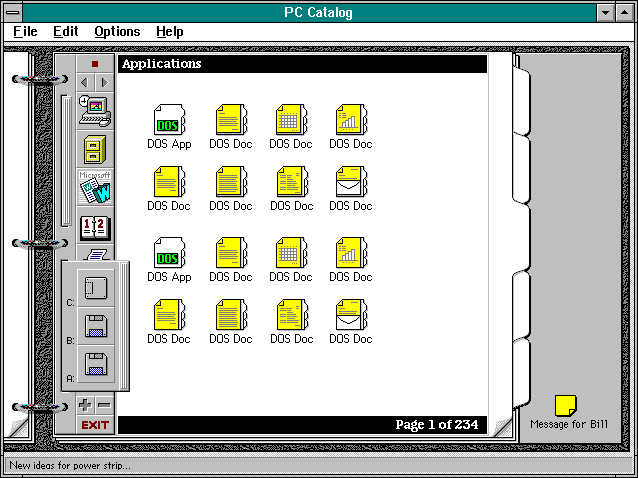
FIGURE 2: In an early design left and right page turning controls
were separate. The tab title and page number appeared at the top and bottom, respectively. The
"ButtonStrip" on the left included pull-out panels to access disk icons and system controls, in
addition to application launching buttons.
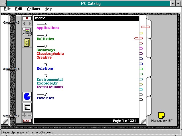
FIGURE 3:In this early design, application launching and system
information
buttons were both attached to the "ButtonStrip" on the left. Color paper clips were explored as a
mechanism to mark specific pages within tabs. In this image the paper clips are shown in
different locations to facilitate discussion about how they might be used.
Using the mock-up helped us to determine which representations were the most
economical and advantageous. We quickly noticed that the representation of a realistic binder
would require extensive use of perspective and foreshortening, which would be difficult given the
small color palette ( the standard Windows 16 colors ), low resolution and the fact that we
wanted to devote as much screen space as possible to functional aspects. Instead, we decided to
explore simpler representations of the binder's elements, relying on small details ( e.g., the
depiction of rings, hints of the cover texture framing the inside of the book, dog-eared page
corners, etc.) and subtle modeling to suggest a more three-dimensional look.
We knew that performance issues curtailed our use of animation in the interface but
we tried to identify elements that would be useful and implementable, such as page or tab
turning effects. Experience with the mock-up ( and later computer simulations ) suggested that
some of the easy and transparent interactions of the real-world object would translate into
repetitive, and potentially annoying, animations on-screen and would require abstract and un-
intuitive control mechanisms to manipulate a fully three-dimensional book layout. Using
animation also meant punishing users of less capable machines - those with limited storage
capacity and slower processor speeds - by either substantially increasing the size of the installed
application to include pre-rendered sequences or accepting the inadequate performance of real-
time animation.
The mock-up also revealed alternatives for binder/tab behavior and layout. When laid
flat and opened, the left hand side of the binder seldom contained useful information, aside from
the ( possibly hidden ) text of previous tabs. Furthermore, on the right hand side of the open
binder, tabs were only visible if they were in the topmost row; looking at additional tabs required
rotating the binder or peering along its side. In an on-screen interface, the tabs would have to be
spread in order to view them all simultaneously.
Some functionality did not seem to work well within the book metaphor. For example,
including extensive system information and controls ( as in Dashboard ) cluttered the book and
reduced the amount of space available for documents and applications.
<,p>
We also considered how the binder-metaphor shell functionality could be integrated in
upcoming versions of Windows. What longevity and perceived value would a shell have? How
should the product be positioned in marketing and development terms? Instead of a shell, the
product could be positioned as a container/organizer.
The XSoft team built working prototypes of the book containing different features that
would be tested with users. We built additional design prototypes to explore the evolving visual
representations and behaviors of the features being tested. Working prototypes were updated
accordingly.
We initially proposed a two phase evaluation program. First, to perform semi-
structured user trials with representative users, and second to carry out field trials where
specially selected individuals would take the product away and use it for a period of time. It was
anticipated that the semi-structured user trial would provide information which related directly to
the product's functionality, whereas the field trial would better explore how the product would fit
into a person's existing work pattern, especially with regard to the advantages offered by a
metaphor with multiple containers.
Unfortunately, due to time constraints, only the semi-structured user trials could be
performed. As a result, their scope was broadened to include a 'free exploration' section where
the user was encouraged to 'play' with the product. In addition, another structured part was
introduced so that navigation between various containers could be better explored. We chose not
to conduct the trials in a usability lab where the moderator and participant are physically
separated from each other, and instead set up a dedicated space at IDEO's studio in San
Francisco. Being 'face to face' with the participant tended to facilitate observation; especially with
regard to being sensitive to gestures, understanding context of behavior and seeing exactly what
they were looking at.
XSoft's marketing group wanted to aim the product at wide range of users, from
prospective users to experts. We therefore recruited people representing this range. In
conjunction with XSoft's marketing group we identified five types of users: prospectives, novices,
intermediates, advanced and experts. Prospectives were classified as people who had never used
a PC but were about to start. Novices were just learning to use a PC, whereas intermediates were
people who were able to do most of what they wanted. Advanced users considered themselves
competent using the computer and experts were those who were able to do everything they
wanted.
Finding participants was achieved by designing a screener which was then used by a
recruitment consultancy. Using a recruitment consultancy enabled IDEO to retain control over
participants while reducing cost and time. In addition to the initial screener, a participant profile
was developed which was administered at the beginning of the trial. This further investigated
their general computing experience, explored how they managed their computer work,
determined where they used the computer and for what tasks they used it.
The test protocol was tested by performing a series of pilot trials. This helped us
rectify any ambiguity that may have existed in the questions, allowed us to approximate how long
the trial would last and provided an opportunity to fine tune the instructions which were given to
participants. Performing the pilot trials enabled us to also include, and occasionally exclude,
certain questions which either needed further exploration or tended to confuse the data being
obtained. We also found that prospective and novice users required a tutorial on some of the
fundamental aspects of computing, how to use a graphical user interface and how to operate a
mouse. It was important to ensure that it was the product participants were reacting to, rather
than to computing.
Findings were presented to the combined IDEO and XSoft teams for discussion in a
succinct report. We generated new iterations of attributes which needed improvement. In
addition, the definition of how the product should be positioned - shell vs. container - was once
again discussed in light of the findings. It was agreed that the container strategy would be
adopted.
Specifically, improvements to the appearance and positioning of page turners, table
of contents, tabs and the book itself were made. Furthermore, changes to the grouping and
positioning of pull down menus were made, as well as to interface terminology ( e.g.,
"placements" became "icons" became "items" ).
To our surprise, users' instincts often contradicted our common sense as designers.
In an early design, when a user clicked a tab, it moved to the front and the others were
rearranged accordingly ( see Figure 4a and Figure 4b ).
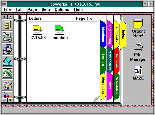
FIGURE 4a:An Early Design. The "Team" tab is selected. It is in the first row
and contiguous with its pages, therefore no tab row rearrangement is necessary.
FIGURE 4b:Selecting the Letters tab requires tab row rearrangement to move
it from the second to the first row so that it will be contiguous with its pages.
Tests showed users were confused by this behavior and found navigation difficult. In
subsequent designs ( see see Figure 5a and Figure 5b ) the selected tab didn't change its
position.
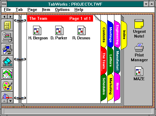
FIGURE 5a.The Final Design. The "Team" tab is selected. It is in the first row and
contiguous with its pages, therefore no tab row rearrangement is necessary.
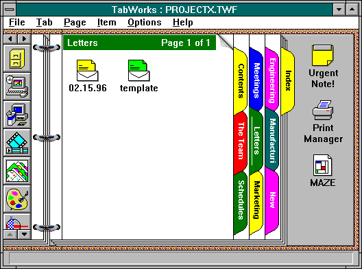
FIGURE 5b. In this case, when the Letters tab is selected it retains its position within
the tab cluster. A title bar of matching color reinforces the fact that its pages are now shown.
Testing validated this implementation; a stable configuration of tabs made navigation
easier. To support this behavior we devised visual and interaction cues to identify the selected
tab ( using the color of the selected tab in a page title bar and underlining the title on the tab ).
We had thought the tabs themselves would serve as both navigation devices and labels for the
current location in the binder. In the final implementation they became - as in our physical mock-
up - primarily navigation devices. The inclusion of a color tab title bar on every page proved a
more viable identification scheme.
Some elements that were initially functional remained only as visual cues in the final
design. For example, user tests indicated the binder rings and the cover strongly reinforced the
metaphor; they didn't need to be functional mechanisms in order to serve a useful purpose.
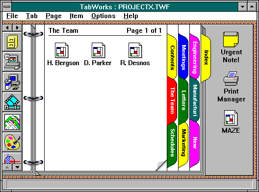
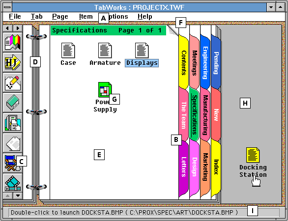
FIGURE 6:The Open Book.
The final design for the TabWorks interface and
some of its main features: [ A ] The Menu Bar shows TabWorks' tab-page-item structure. At one
point we wanted to use a "Book" instead of a "File" menu to reflect the container hierarchy (
Book / Tab / Page / Item ). Instead, we decided to follow standard Windows usage. [ B ] The Tab
Cluster includes Contents and Index Tabs - provided by default - that allow the user to see and
access the contents of the Book using outline and alphabetical views. The user can create, name,
arrange and delete tabs. [ C ] The scrolling Button Strip provides single-click launch buttons for
applications and documents and is available no matter which tab or page is displayed. The user
adds items to it using drag-and-drop and can click-drag the buttons to rearrange them. [ D ] The
Rings Area allows the user to move the pointer off the single-click buttons in the Button Strip
without launching an item. [ E ] Pages show the tab titles by default and page titles as an
option. The user can add, name and delete Pages. [ F ] The user moves from page to page using
the Page Turning Corners or through menu and keyboard commands. [ G ] Items are added to
Pages using drag-and-drop or from a dialog box. Long filenames are available to the user as well
as custom icons. [ H ] The Holding Area can be used to store temporary item groupings. [ I ]
The Status Bar displays information about the item currently under the hand cursor.
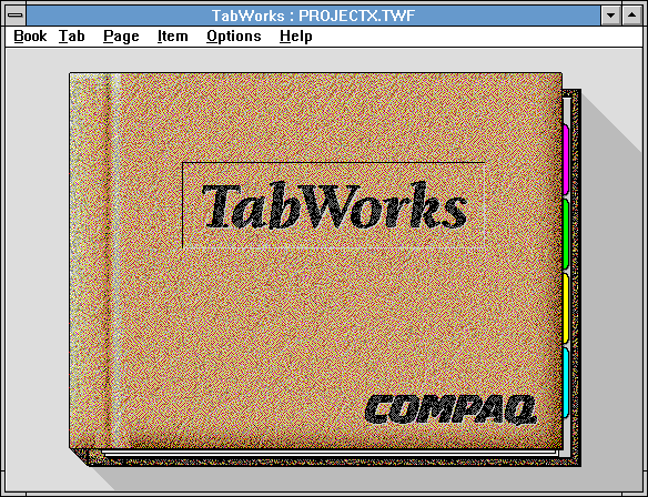
FIGURE 7:The Book Cover appears while the book is loading, then
opens
automatically to the display in Figure 6.
The initial working name for the product, PC Catalog, went through many revisions.
TabWorks was selected late in the development process and was indicative of the main
interaction mechanism in the product.
TabWorks shipped in November of 1993, giving users of Windows 3.1 new ways to
organize applications and documents. Based on product reviews to date, it met a need in the
marketplace. TabWorks was the result of applying an iterative, user-centered methodology.
Collaboration between the XSoft and IDEO teams ensured design decisions were informed by both
technological and human interaction concerns. Involving users throughout the process allowed
continuous improvement that resulted in an easy to use and useful product.
Introduction
XSoft ( a division of Xerox Corporation specialized in document management software)
approached IDEO ( a product design consultancy ) in December of 1992 to assist in
development of PC Catalog, a Windows application based on a book metaphor. The design brief
stated that the product would use the standard Windows 16-color VGA palette and have a
maximum size, including window title, menu bar and borders, of 640 by 480 pixels. Our task was
to create a design that implemented this metaphor in an elegant, usable and economical way
within the constraints of the delivery platform. In other words: the design had to be engaging,
easy to use and useful, and require as little of the computer's resources as possible.
A User-Centered Design Process
We approached the problem with a user-centered, iterative method, similar to those
discussed by Gould and Lewis and by Moggridge [ 1, 4 ]. An interdisciplinary team of IDEO
interaction and human factors designers worked with XSoft's developers and marketers over a
period of nine months. Our goal was to understand the needs of potential end users and, within
the scope of our design brief, create interface mechanisms that would best serve them.
OBSERVING AND UNDERSTANDING:
In order to visualize the metaphor, we wanted a better understanding of what
functionality should be provided by the product. We began the process by informally observing
users and reviewing as many products that offered similar capabilities as our schedule and
budget constraints allowed.
GATHERING MATERIAL FOR VISUALIZATIONObserving Users
Our design brief was to "visualize and articulate a book metaphor as a mechanism to
store and organize documents and applications." However, we prefer to approach design
problems from the user's point of view, which requires an understanding of the user's context.
This often has the effect of widening the problem's scope but helps us design for the environment
in which the final product will exist. Our first step was therefore to observe how users "store and
organize documents and applications," independently of the proposed metaphor.
The Physical Environment
Informal observations were conducted to gain insight into what methods and
mechanisms were used by naive, intermediate and advanced users to deal with documents and
applications in their computer and physical environments. Over 20 Macintosh and Windows users
were observed at IDEO and XSoft. Our findings were similar to those noted in other studies [ 2,
3]; people working with numerous documents always made some attempt at containment.
Drawers, piles, binders, folders, boxes, envelopes, rubber bands, clips and other devices were
used to keep groups of documents together. We noted three main reasons for containment.
These were: organization/access, transportation and safekeeping.
The Computing Environment
In contrast, computer interfaces offered few containers. We also observed that users
often failed to discover or use their full functionality. Windows 3.1 offers two container
strategies: Program Groups within Program Manager and folders within File Manager. Only
advanced users customized the containers in Program Manager extensively. They also used File
Manager and found little difficulty moving from one to the other, even though the look and
behavior of containers was quite different in each of these applications. Intermediate users
tended to make use of File Manager only, creating directories and sub-directories represented by
folder icons in an outline-style hierarchy. Naive users did little customization, relying solely on
the Program Manager Groups provided. These users seldom created containers on their
computers, though they did so easily in the real world. All Macintosh users observed created
containers. They constructed flat hierarchies that quickly filled their desktops with numerous
folders and files, or a complex hierarchy of nested folders requiring significant navigation. We
observed that some Windows and Macintosh users never moved beyond default conditions,
relying on specific applications ( e.g., a word processor ) to find their files wherever they
happened to reside in the system. These observations suggested that users could benefit from
additional container strategies.
Related Products
We also looked at a variety of Windows and Macintosh products with similar or
related functionality. Our goal was not simply to compare product features but to understand
how their intended markets were related to their chosen metaphors and functionality. Products
including Norton Desktop for Windows, Hewlett Packard's Dashboard and Apple's At Ease and At
Ease for Workgroups were reviewed.
A 3-Ring Binder with Tabs
Insights gained from these comparisons were useful in determining the extent of
functionality for PC Catalog and how realistic the representation of that functionality should be.
We wanted a distinctive product look that expressed all the available functionality while leaving
sufficient system resources for users to run their applications. Based on our observations and
because it was in keeping with the main goal of PC Catalog - allow users to organize and access
documents and applications - we arrived at a book metaphor consisting of a three-ring binder
with labeled tabs. This container did appear well suited to the functionality goals stated in our
brief; at a glance, it would be likely to suggest a containment strategy and what functionality to
expect.
VISUALIZING THE METAPHOR
Inspired by the experiences described above we set out to visualize how the binder
metaphor might be expressed on-screen. During the observations we noted common binder
elements easily recognized by users; these suggested possible implementation styles and
functionality for the computer interface. Figure 2 and Figure 3 depict some early iterations of
the design during these phase.
Using a Physical Mock-Up
We began by using a real binder to explore how it worked and how we could represent
its elements and functions on-screen. We created different tab and page arrangements using a
variety of tab and page styles. Using this mock-up we were able to try out many possible layouts
and functions more realistically than with paper sketches and much more expediently than
computer simulations would have allowed. We played out functions such as opening the book
cover, selecting a tab to open the book to that section as well as adding and removing tabs and
pages and moving items from one place to another, while asking ourselves how they could be
best translated to the flat medium of the computer screen - within the constraints stated in our
design brief.
Constructing Software Prototypes
These experiences with the mock-up helped us to understand elements and behavior
for the product's user interface. We then built design prototypes using Macromedia Director to
demonstrate how these elements - covers, pages, tabs, bookmarks, paper clips, pockets, sticky
notes - would be expressed in a computer interface. Some prototypes were not interactive, they
explored alternative looks for these elements ( e.g., Two rows of tabs or ten? Horizontal or
vertical tabs? Color as a highlighting strategy? More or less realistic representation of the binder
rings? ). In other prototypes we used animation to simulate specific interaction sequences, such
as clicking on tabs, moving from page to page, adding elements by dragging icons from other
windows into the book or launching applications from a button strip feature.
DEFINING THE PRODUCT
We used the design prototypes in brainstorm sessions and presentations with the
XSoft development team to identify key features thought essential to the metaphor and to
eliminate un-implementable functionality. We modified but retained some features. For example,
functionality associated with the binder rings ( clicking on them to add or delete tabs and pages )
was dropped due to implementation issues. The rings themselves, however, remained to be tested
as identifying elements of the metaphor.
CONDUCTING USER TRIALS
We performed user trials as early as possible to identify usability problems, assess
early implementations and obtain feedback from potential users. More extensive user trials were
carried out at a later date by XSoft and Compaq using more advanced versions of the product.
Their aim was to quantitatively compare TabWorks to Program Manager in terms of performance,
preference and user satisfaction. In contrast, our aim was broadly to find out what
characteristics of our design were working well, which features were easy and intuitive to use,
what was difficult to use, what caused confusion and how people reacted to the concept as whole.
Our intent was to obtain information which could be fed back directly into the design loop,
whereas their goal was to evaluate the product.
Pilot Trials
We developed the test protocol by performing an initial 'walk through' of product
functionality. This led to the immediate identification of potential usability problems. These were
recorded and added to a list of other usability issues provided by the rest of the team. As issues
for investigation arose, tasks were designed to explore them. Finally, questions were formulated
which introduced and then encouraged participants to try the tasks. It was important to phrase
the questions in such a way as to be completely 'neutral', i.e., that they did not imply a correct
methodology or approach.
Test Protocol
First, participants completed a profile questionnaire and read the test instructions.
Every participant was given an overview of the products' intended use, was reminded to talk
aloud, and told that it was the product that was being tested, not them. Participants were shown
the product and first impressions were elicited to its overall appearance and functional elements.
They were then encouraged to explore the system as they saw fit. As they did this, the moderator
asked questions about what they were thinking, what they expected to happen next and what their
impressions were. Once subjects began to exhibit a level of comfort and familiarity with the
system they were encouraged to begin the structured tasks. The structured tasks explored
utilization of the table of contents; opening, using and saving files and applications; making,
moving and deleting new sections and pages in the book; and navigating between TabWorks and
Windows. Finally, everyday operation of the product was explored in a semi-structured part of the
trial where participants were asked to use the product as they would in their typical work. These
tasks included: naming sections, moving them around, using multiple applications, grouping
related items together, installing new books, and using special navigation tools and containers
such as bookmarks and pockets.
Findings
The trials identified usability issues at three levels: conceptual, general and detailed.
Conceptually, some people tended to become confused as to whether the product was a shell or a
container. This was especially true for the naive and inexperienced users who would suddenly
find themselves on the 'desktop', having 'lost' TabWorks behind another window that had opened.
On a general level, experienced users expressed concern that they were working more slowly;
they felt they were doing double work with both TabWorks and File Manager. In addition, users
expected more contextual help to be available than was provided. A number of usability issues
were found which related to general operation, such as page turner size and location, and
whether tabs should move or not when selected. It was possible to identify functional elements
which were difficult to use and whose functionality was not intuitive. Of particular interest was
the functionality of the delete mechanism and the potential to mistakenly remove a number of
items at once.
THE LIMITS OF THE METAPHOR
User testing and rapid prototyping allowed us to discover where and how to enforce,
break and sometimes contradict the metaphor in ways that enhanced its usefulness and usability.
We knew, for example, that double-clicking a folder icon on the Macintosh opens a window
bearing no resemblance, visually or functionally, to a folder. Users were not bothered by this.
Similarly, we wanted to explore the boundaries of the binder metaphor representation.
ARTICULATING A METAPHOR
As a result of these design-test-redesign cycles we chose and defined key elements of
the metaphor. The book cover opened to display three rings binding a set of divider tabs, each
containing one or more pages. Pages contained items - icons representing documents or
applications. Users could create multiple books. Users could name their books, divider tabs and
pages and add or delete tabs, pages and items which could be rearranged in different ways. An
area next to the rings, accessible at all times, kept frequently used applications or documents
handy. Figure 6 and Figure 7 show the main features of the final user interface.